Hello,
On my diagrams i often need to add visual clue of the meaning of my tab like :
- for export
- clean
- Temporary/optionnal
-…
Is it possible to add the option to choose color of the tab ? or add some icon on it ?
Thx
Hello,
On my diagrams i often need to add visual clue of the meaning of my tab like :
Is it possible to add the option to choose color of the tab ? or add some icon on it ?
Thx
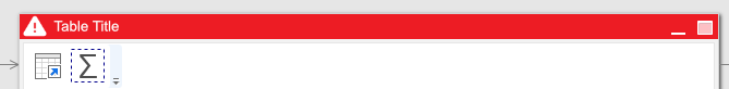
Is it tab or table header? In the post title it’s “table” but in the text it’s “tab”.
I made an ideal color usage here  it’s easier than text explaination.

Same for us here.
It would help a lot to use different colors for tables, which are
Even better would be the possibility to use differenrt colours on actions, too.
For example: I often add a filter action to reduce the amount of records of an imported file for testing reason. It would make it much easier to colorize the actions, which have to be deleted (or deactivated) after completing the test.
This would be great.
Each color could be associated to a user defined tag. i.e : red = checking, yellow = from accounting…
in the Diagram we coul have a tab after Dependencies where the tables would be gathered by color/tag
Regards
Would love this feature as I have some tables that are there for information only, e.g. the totals by client so we can easily identify problem clients(!) and other tables that display missing information that needs to be added to the source so that our reports are delivered correctly.
One note I would also make here is changing the color is great, but I would also consider those that are colorblind:
Colour (color) blindness (colour vision deficiency, or CVD) affects approximately 1 in 12 men (8%) and 1 in 200 women. In the UK there are approximately 3 million colour blind people (about 4.5% of the entire population), most of whom are male. Worldwide, there are estimated to be about 300 million people with colour blindness, almost the same number of people as the entire population of the USA!
Source: About Colour Blindness - Colour Blind Awareness
Because of this I think it would also be good to look at adding an icon to go along with the color, e.g.
It would also be good if the colour being chosen here would be the same for the lines in the Diagram view - at the moment my Diagrams look like spaghetti and it’s difficult to see what’s going on, but if they were coloured the same as the tables they’re coming from I would know for example that the incoming data is from user data, stock, etc.